Difference between revisions of "Workflow Forms definition"
| Line 58: | Line 58: | ||
| − | + | See [[Form Element description]] for a detailed definition of every form element. These form elements have also an additional property called "readonly" with can be used to make a property not modifiable by the user. | |
| − | |||
| − | |||
| − | |||
| − | |||
| − | |||
| − | |||
| − | |||
| − | |||
| − | |||
| − | |||
| − | |||
| − | |||
| − | |||
| − | |||
| − | |||
| − | |||
| − | |||
| − | |||
| − | |||
| − | |||
| − | |||
| − | |||
| − | |||
| − | |||
| − | |||
| − | |||
| − | |||
| − | |||
| − | |||
| − | |||
| − | |||
| − | |||
| − | |||
| − | |||
| − | |||
| − | |||
| − | |||
| − | |||
| − | |||
[[Category: Workflow Guide]] | [[Category: Workflow Guide]] | ||
Revision as of 21:02, 2 October 2011
| New feature in OpenKM 4.1 |
When you want to retrieve data from an user in the workflow, you have to define a way to do so. OpenKM uses the forms.xml file to draw the components in the form. See this sample:
<?xml version="1.0" encoding="UTF-8"?>
<!DOCTYPE workflow-forms PUBLIC "-//OpenKM//DTD Workflow Forms 2.1//EN"
                                "http://www.openkm.com/dtd/workflow-forms-2.1.dtd">
<workflow-forms>
  <workflow-form task="MyTask">
    <input label="Amount" name="amount" />
    <button label="Submit" />
  </workflow-form>
</workflow-forms>
Here we can see an XML which describes the components related to a task called "MyTask". This means that when when workflow is executing the "MyTask" task, it need the user who is assigned this task to enter some information to continue. In the description, we can see an INPUT where the user should type an amount.
As you can see in the XML DOCTYPE, there is a formal definition at http://www.openkm.com/dtd/workflow-forms-2.1.dtd.
Now let's see a more complete form definition:
<?xml version="1.0" encoding="UTF-8"?>
<!DOCTYPE workflow-forms PUBLIC "-//OpenKM//DTD Workflow Forms 2.1//EN"
"http://www.openkm.com/dtd/workflow-forms-2.1.dtd">
<workflow-forms>
<workflow-form task="Sample">
<input name="input" label="Input"/>
<input name="date" label="Date" type="date"/>
<input name="folder" label="Folder" type="folder"></input>
<select name="options" label="Options">
<option label="One" value="one"/>
<option label="Two" value="two"/>
<option label="Three" value="three"/>
</select>
<checkbox name="check" label="Check"/>
<textarea name="textarea" label="TextArea"/>
<separator name="separator" label="Separator"/>
<text name="text" label="This is a <font style='color: red'>sample</font> text"/>
<button name="submit" label="Submit" />
</workflow-form>
</workflow-forms>
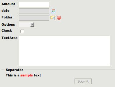
This form definition is rendered as this:

See Form Element description for a detailed definition of every form element. These form elements have also an additional property called "readonly" with can be used to make a property not modifiable by the user.